Before going into the key features of a landing page, I’d like to quickly look at what a landing page is and what it’s used for.
What’s a Landing Page?
A landing page is the page a user reaches after clicking on a text ad, banner, link or organic search result in an engine like Google, Bing or Yahoo. This page is often not integrated into your website and prevents users from continuing to browse to avoid escapes or distractions.
What’s it used for?
This page is used to give more information and must have a clearly defined purpose. This purpose may vary according to the type of company, product or service being sold and the real objective.
Objective types:
- Sell a product
- Sign-up users
- Subscribe to a newsletter
- Download a document or software
- Any other activity you want users visiting the landing page to perform.
Elements of a Landing Page
There are a set of clearly defined elements on a landing page. Each needs to be optimized to achieve a perfect landing page.
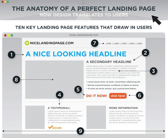
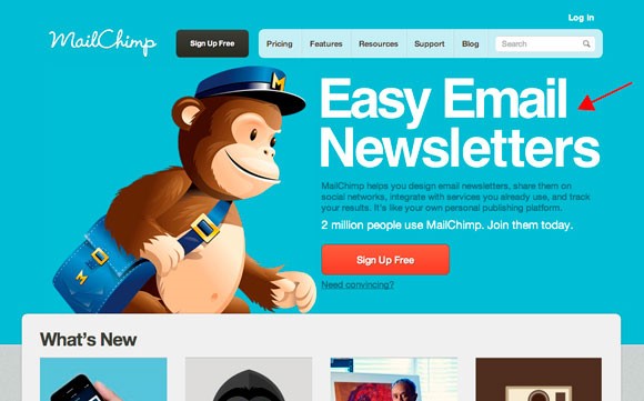
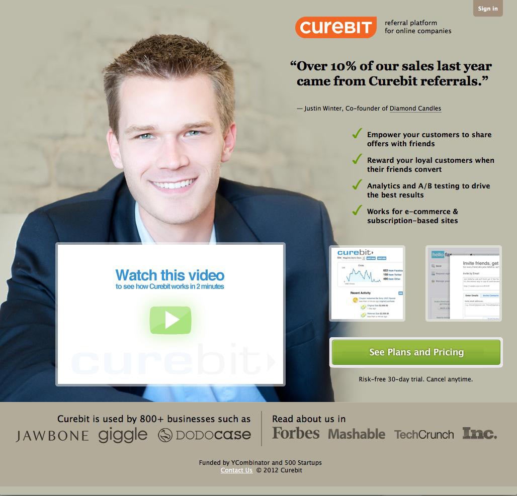
Headline
The headline is vital as it must stand out and capture user attention and interest so that they read the rest of the message.
Tips for defining and displaying the headline:
- Leave white space around your headline to make it stand out and ensure it is easy to read.
- Use a different font from your other content that is easy to read and calls user attention.
- Use a suitable font size, in keeping with the other elements on your landing page.
- Don’t align the headline with the other text to ensure it stands out from the rest of the content.
- It’s really important to include the main SEO and PPC keywords in both the headline and your content.
Secondary Headline
If your headline captures user attention and interest, the secondary headline needs to keep them on the page. It supports and reinforces the title.
Secondary headlines are normally placed below the headline on the landing page and should contain something persuasive that invites users to stay on the page and keep reading.
It could explore and deepen the contents of the main headline.
Image or video (visual or multimedia content)
Include an image or multimedia content that “sells” your product or service. Don’t forget a picture is worth a thousand words.
Tips:
- Photos that show people or the product being used have much higher conversion rates than a simple product shot.
- Increasingly, products are shown in 360º, allowing users to rotate them to see every angle and detail.
- It’s also important to consider that unlike stills, multimedia content adds value and can display key additional information.
This image or piece of multimedia content must always convey positive sensations and the benefits of acquiring and using the product. It must be in keeping with the message you give users in every element making up the landing page.
Images and multimedia content must also be top quality in terms of their format and design.
Explanation
If a user doesn’t understand or get the message you wish to convey quickly, you’ve lost them.
Your detailed explanation is vital. The most effective explanations are simple and direct.
They can be included in your headline or secondary headline or completely separate from both these elements. But there must always be a narrative thread uniting all of the elements of the overall message being conveyed to users. The message can be focused on communicating the benefits the product gives users. Which is why there is a separate section to highlight this.
Benefits or value proposition
This section is where you need to have clear and direct content to allow users to perceive the benefits or value they gain from your product or service.
It’s important to summarize and highlight the benefits in list form to allow them to be quickly identified and read. The tone must be empathetic to the target audience and convey emotions that go deep.
It’s important to distinguish between the product’s benefits and functionalities. Focus on conveying the benefits that the product gives users or potential clients.
The list of benefits must answer the user’s question: What does buying this product or service give me?
Form
If the aim of your landing page is to get users to complete and send a form, you need to analyze and consider the following aspects:
- The fields must be those you require, no more, no less. The less information you request, the more likely they are to complete it. Obviously this information needs to be what you need to be able to follow-up on the lead later, as part of the sales process defined for your product or service.
- The form has to be very simple and easy for users to understand. If necessary, it must include clear and concise instructions.
- Specify the mistakes or need to complete mandatory fields clearly, subtly and politely.
- Convey security and confidence. It’s important to inform users that their personal information will be handled securely and in compliance with local legislation on personal information.
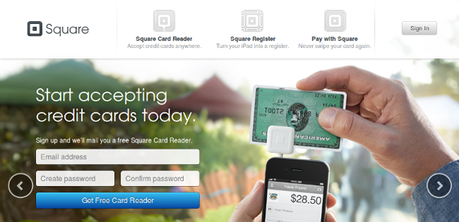
Call to Action
This is a key element as it’s what you want users to do to comply with the objective action.
This button must be designed carefully with a suitable size, color, location and message, as simple changes can positively or negatively affect conversion rates.
The message is very important and must be simple, clear and attention grabbing to inspire users to perform the action. Generally, these are designed using a larger font that stands out from the rest of the content on the landing page.
Remember to try and ensure that the most important information is displayed when the page first loads, without users having to scroll down. The user device format and screen size must always be taken into consideration (PC, tablet or mobile). The design must be responsive and adapt content for each format.
Testimonials
Commonly used in the US market, real, credible comments left by customers who bought the product instill great confidence. For B2B businesses, it’s vital to include comments by managers from your client companies.
Testimonials add value and humanize your message, taking it closer to clients.
It’s important to identify the people who are leaving testimonials (name, company, position) and to include a photo.
Second opportunity
Often, a second call to action can help capture leads who aren’t yet ready to buy.
This includes social buttons for networks including Facebook or Twitter. Adding these to a landing page can entice users who are not interested this time to enter into the circle of influence so as to maintain a connection and send them more information to help the product purchase process.
Second opportunities can also be included on the payment confirmation page.
Remember that even considering the importance of process of designing, drafting and configuring a landing page, measuring the overall results and the individual results of every element included in the page is as or even more important. It’s a good idea to do an A/B test on 2 or more landing page designs to measure effectiveness and to use the one that gets the best conversion rate for your business. Remember that a landing page isn’t static and can be improved and optimized in line with the results obtained.
If you have experience in developing and implementing landing pages, please leave us your comments and suggestions. And if you need any support, please contact us directly, we’re always delighted to help.
Image rights:
https://klientboost.com, http://www.onextrapixel.com/, https://www.adluge.com